|
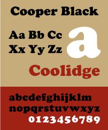
Cooper Black
 Cooper Black is an ultra-bold serif typeface intended for display use that was designed by Oswald Bruce Cooper and released by the Barnhart Brothers & Spindler type foundry in 1922.[1] The typeface was drawn as an extra-bold weight of Cooper's "Cooper Old Style" family. It rapidly became a standard typeface and was licensed by American Type Founders and also copied by many other manufacturers of printing systems.[2][3][4] HistoryCooper Black originated from from Oswald Cooper's career as a lettering artist in Chicago and the Midwest of America in the 1920s.[3][5][6] Cooper Black was advertised as being "for far-sighted printers with near-sighted customers", as well as "the Black Menace" by detractors.[7] While very bold, Cooper Black is based on traditional "old-style" serif lettering, rather than the hard-edged "fat face" fonts popular in the nineteenth century, giving it a soft, 'muddy' appearance, with relatively low contrast between thick and thin strokes.[8][9][10][11] UsageAfter its release in 1922, Cooper Black quickly became a popular typeface for use in advertising, especially in newspapers.[12] Although its use in advertising declined in the 1960s, it became much more popular in pop culture after appearing on the cover art for the 1966 album Pet Sounds by The Beach Boys.[13] Since then, it has been featured on multiple other album covers, including David Bowie's Ziggy Stardust and The Doors' L.A. Woman.[8] The 2010 alternative hip hop collective Odd Future also used it frequently, using it for album covers such as the cover of The OF Tape Vol. 2. Former Odd Future member, Tyler, the Creator used it for his Bastard and Goblin album covers.[4] Cooper HiliteCooper Hilite is a version of Cooper Black originally designed by painting white relief impressions into a printed proof of Cooper Black.[3] It has been digitized by ParaType and Wordshape.[14] Imitations and variantsCooper Black was immediately popular and spawned imitations, including Goudy Heavy Face from Frederic Goudy, Ludlow Black and Pabst Extra Bold.[15][16] Cooper Black remains popular: the editors of the typography discussion website Fonts in Use report more submissions of its use than any other face that is not a sans-serif, although outnumbered by Times New Roman once its many variants are added up.[17] Many unusual versions of Cooper were created in the phototypesetting period of the 1960s and 1970s, a period of explosion in the production of display faces. These included "Ziptop Cooper Black" from Photo Lettering Inc., a version with the top bolder than the bottom, and other distorted variants.[18] Many digitisations of Cooper Black exist from companies including Bitstream, Adobe and others.[11] Soap, designed by Ray Larabie of Typodermic, is a uni-case variant.[19] A version from URW, which does not include an italic, is bundled with many Microsoft products.[20] Cooper Old Style has been digitised by URW.[21] Miles Newlyn designed the New Kansas typeface, based on the Cooper Black typeface.[22] Owen Earl digitized the original Cooper family as Cooper*.[23] Gallery
See alsoReferences
Further reading
External links |
||||||||||||
Portal di Ensiklopedia Dunia


