|
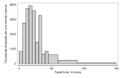
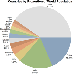
Frequency (statistics)In statistics, the frequency or absolute frequency of an event is the number of times the observation has occurred/been recorded in an experiment or study.[1]: 12–19 These frequencies are often depicted graphically or tabular form. TypesThe cumulative frequency is the total of the absolute frequencies of all events at or below a certain point in an ordered list of events.[1]: 17–19 The relative frequency (or empirical probability) of an event is the absolute frequency normalized by the total number of events: The values of for all events can be plotted to produce a frequency distribution. In the case when for certain , pseudocounts can be added. Depicting frequency distributionsHistogram of travel time (to work), US 2000 census Bar chart, with 'Country' as the categorical variable for the discrete data set Horizontal 3D bar chart Different ways of depicting frequency distributions A frequency distribution shows a summarized grouping of data divided into mutually exclusive classes and the number of occurrences in a class. It is a way of showing unorganized data notably to show results of an election, income of people for a certain region, sales of a product within a certain period, student loan amounts of graduates, etc. Some of the graphs that can be used with frequency distributions are histograms, line charts, bar charts and pie charts. Frequency distributions are used for both qualitative and quantitative data. Construction
Generally the class interval or class width is the same for all classes. The classes all taken together must cover at least the distance from the lowest value (minimum) in the data to the highest (maximum) value. Equal class intervals are preferred in frequency distribution, while unequal class intervals (for example logarithmic intervals) may be necessary in certain situations to produce a good spread of observations between the classes and avoid a large number of empty, or almost empty classes.[2]
The following are some commonly used methods of depicting frequency:[3] HistogramsA histogram is a representation of tabulated frequencies, shown as adjacent rectangles or squares (in some of situations), erected over discrete intervals (bins), with an area proportional to the frequency of the observations in the interval. The height of a rectangle is also equal to the frequency density of the interval, i.e., the frequency divided by the width of the interval. The total area of the histogram is equal to the number of data. A histogram may also be normalized displaying relative frequencies. It then shows the proportion of cases that fall into each of several categories, with the total area equaling 1. The categories are usually specified as consecutive, non-overlapping intervals of a variable. The categories (intervals) must be adjacent, and often are chosen to be of the same size.[4] The rectangles of a histogram are drawn so that they touch each other to indicate that the original variable is continuous.[5] Bar graphsA bar chart or bar graph is a chart with rectangular bars with lengths proportional to the values that they represent. The bars can be plotted vertically or horizontally. A vertical bar chart is sometimes called a column bar chart. Frequency distribution tableA frequency distribution table is an arrangement of the values that one or more variables take in a sample. Each entry in the table contains the frequency or count of the occurrences of values within a particular group or interval, and in this way, the table summarizes the distribution of values in the sample. This is an example of a univariate (=single variable) frequency table. The frequency of each response to a survey question is depicted.
A different tabulation scheme aggregates values into bins such that each bin encompasses a range of values. For example, the heights of the students in a class could be organized into the following frequency table.
Joint frequency distributionsBivariate joint frequency distributions are often presented as (two-way) contingency tables:
The total row and total column report the marginal frequencies or marginal distribution, while the body of the table reports the joint frequencies.[6] InterpretationUnder the frequency interpretation of probability, it is assumed that as the length of a series of trials increases without bound, the fraction of experiments in which a given event occurs will approach a fixed value, known as the limiting relative frequency.[7][8] This interpretation is often contrasted with Bayesian probability. In fact, the term 'frequentist' was first used by M. G. Kendall in 1949, to contrast with Bayesians, whom he called "non-frequentists".[9][10] He observed
ApplicationsManaging and operating on frequency tabulated data is much simpler than operation on raw data. There are simple algorithms to calculate median, mean, standard deviation etc. from these tables. Statistical hypothesis testing is founded on the assessment of differences and similarities between frequency distributions. This assessment involves measures of central tendency or averages, such as the mean and median, and measures of variability or statistical dispersion, such as the standard deviation or variance. A frequency distribution is said to be skewed when its mean and median are significantly different, or more generally when it is asymmetric. The kurtosis of a frequency distribution is a measure of the proportion of extreme values (outliers), which appear at either end of the histogram. If the distribution is more outlier-prone than the normal distribution it is said to be leptokurtic; if less outlier-prone it is said to be platykurtic. Letter frequency distributions are also used in frequency analysis to crack ciphers, and are used to compare the relative frequencies of letters in different languages and other languages are often used like Greek, Latin, etc. See also
References
|


