|
FF Scala Sans
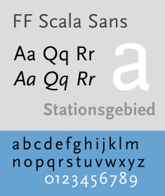
FF Scala Sans is a humanist sans-serif typeface designed by Dutch designer Martin Majoor in 1993 for the Vredenburg Music Center in Utrecht, the Netherlands. It was designed as a companion to Majoor's earlier serif old style typeface FF Scala, designed in 1990. Like Eric Gill's 1927–30 design Gill Sans and Hans Eduard Meier's typeface Syntax, both upper and lower case are structurally modeled on serif old style faces. The lowercase roman a and g are two-story. FF Scala Sans italics are true italics, not sloped roman. The lowercase a, e, v and y are particularly calligraphic. FF Scala Sans is a very complete sans-serif in its inclusion of true small capitals, lining and non-lining (old style figures) and many ligatures. In 1993, an additional condensed width of the typeface was released. The typefaces are available through Font Shop International. In 2023, the font, alongside its companion FF Scala, were reissued as "Scala Sans" and "Scala", respectively on Majoor's own independent type foundry, which was founded in 2021. The typeface is prominently used by the Los Angeles Metro, and the Hungarian weekly magazine Magyar Narancs. FF Scala Sans is less commonly used by Kwik Trip, most notably some of its signage. It is also used by the Museum of Contemporary Art Chicago, as well as the fifteenth edition of The Chicago Manual of Style, JBL Sound Systems, The Elements of Typographic Style by Robert Bringhurst; Nelson-Atkins Museum of Art in Kansas City, Missouri, the Saint Louis Art Museum, Shakespeare's Words: A Glossary and Language Companion by David Crystal, as well as Martin Majoor's official website. It is also used by Wizards of the Coast for Sidebar/Table Body in Dungeons and Dragons 5th Edition Modules as well as Dungeons and Dragons 5th Edition Character Sheets. For a number of years between the mid-2000s and until the mid-2010s, the typeface had been used by Whole Foods Market as a secondary typeface.[1] References
Bibliography
External links
|
||||||||||
