|
Adobe Jenson
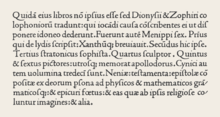
Adobe Jenson is an old-style serif typeface drawn for Adobe Systems by its chief type designer Robert Slimbach. Its Roman styles are based on a text face cut by Nicolas Jenson in Venice around 1470, and its italics are based on those created by Ludovico Vicentino degli Arrighi fifty years later. Jenson is an organic design, with a low x-height. It is considered a highly readable typeface and is accordingly often used in book design for body text. Development  Adobe Jenson was first released in 1996 as a multiple master font.[1] It was created using sophisticated interpolation or multiple-master technology, to create a range of weights and optical sizes suitable for different text sizes.[2] This partial automation of font creation was intended to allow a gradual trend in styles from solid, chunky designs for caption-size small print to more graceful and slender designs for headings.[3][a] It is now sold in the standard OpenType font format under the name Adobe Jenson Pro.[6] Jenson's type used an 'M' with two-way top serifs and a 'Q' with a curled tail, both now not commonly seen; the default characters are more contemporary forms but both were included as alternate characters.[7] Adobe Jenson ProAdobe Jenson Pro is an OpenType update of the original family. The font family supports Adobe CE, ISO-Adobe (later Adobe Western 2), dingbat character sets. The family comes with 4 weights each in roman and italic, and 4 optical sizes. Supported OpenType features include Stylistic alternates, ligatures, proportional numbers, old style figures, small caps, subscripts and superscripts, ordinals, and swashes (italic fonts only).
Related typefacesMany other typefaces have been cut based on the work of Jenson. William Morris's Golden Type created the trend in the 1890s; his design is known for its emboldening of Jenson's original design, giving it something of the feel of blackletter.[8] It is named for The Golden Legend, which was intended to be the first book printed using it.[9][10] Popular since the 1930s, Bruce Rogers' Centaur is a much more slender revival in the same style. American Type Founders' Cloister Old Style was created by its design team led by Morris Fuller Benton around 1915, during the same period as Centaur.[11][12] Ludlow created another release with italic under the direction of Ernst F. Detterer and Robert Hunter Middleton in the 1920s.[13] American Type Founders also issued a very eccentric[according to whom?] Jenson revival inspired by the work of Morris which is little-known today.[14]Tobias Frere-Jones created a revival in 1994 named Hightower Text that is bundled with some Microsoft software, adding his own italic design.[15] References
External links |
||||||||||||||||||||||
