|
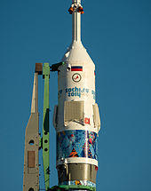
2014 Winter Olympics marketing2014 Winter Olympics marketing was a long running campaign that began when Sochi won its bid to host the games in 2007. SymbolsEmblem The emblem of the 2014 Winter Olympics was unveiled in December 2009. While more elaborate designs with influence from Khokhloma were considered, organizers chose to use a more minimalistic and "futuristic" design instead, consisting only of typefaces with no drawn elements at all. The emblem was designed so that the "Sochi" and "2014" lettering would mirror each other vertically, "reflecting" the contrasts of Russia's landscape (such as Sochi itself, a meeting point between the Black Sea and the Western Caucasus).[1] Critics, including Russian bloggers, panned the logo for being too simplistic and lacking any real symbolism; Guo Chunning, designer of the 2008 Summer Olympics emblem Dancing Beijing, criticized it for its lack of detail, and believed it should have contained more elements that represented winter and Russia's national identity, aside from its blue color scheme and its use of .ru, the top-level domain of Russia.[1] SloganThe Games' official slogan, Hot. Cool. Yours. (Жаркие. Зимние. Твои.), was unveiled on 25 September 2012, 500 days before the opening ceremony.[2] Presenting the slogan, SOC president Dmitry Chernyshenko explained that it represented the "passion" and heated competition of the Games' athletes, the contrasting climate of Sochi, and a sense of inclusion and belonging.[3][4] Look of the GamesMascots For the first time in Olympic history, a public vote was held to decide the mascots for the 2014 Winter Olympics; the 10 finalists, along with the results, were unveiled during live specials on Channel One. On 26 February 2011, the official mascots were unveiled, consisting of a polar bear, a snow hare, and a snow leopard. The initial rounds consisted of online voting among submissions, while the final round involved text messaging.[5][6] ColoursMost Olympic brands choose to represent themselves with 3 or 4 "primary" colours which are often symbolic to the region, as well as "secondary" colours not found in the logo which are often found in less common symbols and/or graphics. Sochi, however, made a statement to symbolise the diversity of Russia, and used over 30 colours from all over the spectrum, in 90 different patterns, all put together in a graphic designed to resemble a quilt. 5 different colour families were used at different venues around the games; Red Orange and Yellow, Yellow and Green, Green and Blue, Blue and Purple, and Purple and Pink. Non-venue areas, as well as volunteer jackets and other public spaces featured all 5 colour families together in one. Banknotes and coinsIn commemoration of the Games, Russian Post released a series of postage stamps depicting athletes, venues, and the mascots of the Games.[7] Video gamesThe official Olympic video game is the fourth game in the Mario & Sonic series, Mario & Sonic at the Sochi 2014 Olympic Winter Games. It was released by Nintendo for the Wii U on 8 November 2013 in Europe, and 15 November 2013 in North America.[8] Others were Sochi 2014: Ski Slopestyle Challenge for Android operating system and Sochi 2014: Olympic Games Resort for online social network Facebook.[9] StampsThe Bank of Russia issued special coins and 100-ruble notes for the Games.[7] Corporate sponsorship and advertisingSponsors
See alsoReferences
|